Solutions for problems should be neatly and clearly written up (typing
helps :-). All computer output that is turned in should be clearly
labeled, and any extraneous material should be removed using an editor.
These are due by 5 pm Tuesday 1/26 in the box outside 219A. You may also turn in the
assignment in class or give it to the TA.
Start up S-Plus using the Start menu. The program may be listed under Programs > Statistics & Mathematics > S-PLUS 2000. If you have questions, please check with the TA.
You can create your own workspace directory for saving your class work, this will help if you need to move files to different computers. See Chapter 7 of the Online Guide to Statistics (under the Help Menu) or follow the instruction on here for creating a workspace.
The next thing we need to do is read in the data. S-Plus stores data in objects called "dataframes". A dataframe is like a matrix or table of numbers, with columns corresponding to variables and rows corresponding to observations. Data in dataframes can be continuous or discrete (numeric) or categorical. For example, the planet names in EX016.ASC would be a categorical variable, while the distance and order are numeric.You can repeat at some point in time the above steps to create dataframes for the data for Ex 24 and Ex 25.
Note for future reference: S-Plus assumes that the first row of the data file contains the variable names.
In exercise 1.16 you are asked to draw a scatterplot of distance versus order.
To add a title to the graph, go to the Insert menu (on the main Menu bar, not the graph menu bar) and select Titles, and Main. Enter in the text. Make sure that the title is clear and informative.
By default S-Plus use the variable names for the axis titles, which may not be as meaningful, for example, log.distance. To modify, click twice on the axis title. Change the @Auto label to the desired text. Click outside the edit box to indicate you are finished. If you want to change the size or type of font, with the text selected change the font or other characteristics. The text may cover multiple lines (just hit return).
Suggestion: It is a good idea to include the units of measurements if possible in the axis title. If possible, indicate the source of the data at the bottom of the figure.
To obtain summary statistics, go to the Statistics menu and select Data Summaries and then Summary Statistics
Specify the dataframe, Ex0116. Click OK if you want summaries of everything. If not, just click to select the summaries that you want. To select variables, click on the first one, and then use Ctrl-Click to select additional variables. Now click OK. The summaries will appear in the Report Window. You may copy/paste them to a Word document.To fit a simple linear regression model, go to the Statistics menu and select Regression and then Linear.
Specify the dataframe, Ex0116.
In order to specify the model, we will need to specify a formula. You may either type it in directly, or click on the button "Create Formula". Let's do the latter. You should see a pop-up window titled Formula.
First we need to specify the response variable. Select log.distance and then below, click on the Response button. In the formula window you should see log.distance~
The "~" or tilde character is used to separate the response variable from the predictor or explanatory variables.Next we need to specify the explanatory variable for our model. Select order in the variables window, and then click the button "Main Effect (+)" to add order to the formula. The formula should now read
To save the fitted values and residuals, click on the Results "tab" at the top of the Linear Regression Window. Under "Saved Results" enter the name of the dataframe, Ex0116, and then click the boxes for Fitted values and Residuals. These variables will be calculated and added as new columns to the dataframe, Ex0116.
Right now we will ignore all plots, so click on the Plot tab and de-select all plots.
Click on OK.In the Report Window, you should have the output with the estimates of the coefficients and their standard errors. In the dataframe, you should have the fitted values and residuals. From this output you should be able to answer all the questions for problems 7.15 and 7.16.
To graph the data, regression line, and prediction intervals, go to the Graph menu and select 2D Plots. This time scroll up to select "Fit - Linear Least Squares". Click on OK.
Specify duration as the x-Column, interval as the y-column. Then click on the "By Conf Bound" tab. Choose "Confidence 0.95" at the bottom. Then choose any easy to view line style, color and width. Click on OK. To add an equation for the regression line to the graph, click anywhere on the regression line. A small green box should appear at the bottom left corner of the graph. Now go to the Insert menu and select "Curve Fit Equation". The equation "object will appear in the screen. You can drag it to another location if need be. As with the axis titles, double click on the text in order to edit it. For example, change x to duration.
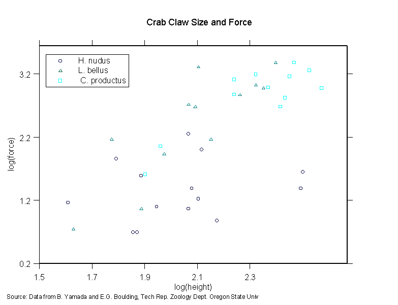
Create the variables log(force) and log(height).
To create the three regressions, follow the instructions for regression from before, but now in the main dialog box we will need to specify the subset of the data to use. The expression "code == 1", will return an indicator that is true for all rows where code equals 1, and is false elsewhere. You can use that expression to specify the subset in order to fit the regression to only species H. nudus. In the Subset Rows with field, enter code == 1.00. Repeat for the regression using code == 2.00 and code == 3.00. The output you need to complete the questions will be in the Report window.
(optional) Here is code for how to create a plot with all three
species for log force (y-axis) versus log height (x-axis). Follow the
instructions for the scatterplot given above, but now specify that the
z-variable is the column for code. We'll use this to specify different
plotting symbols based on code. Click on the Vary Symbols tab in the
Lines/Scatter Plot window. Select the z-column for the Vary Style by
field. (You can vary color as well). Click on OK to create the plot. To
get really fancy, add a Legend to the plot. Go to the Insert menu and
select Legend. In the pop-up window specify 3 for the number of items
(one for each symbol/species). You can specify the location, or just
drag it later to your preferred location. Click on OK. To change any of
the legend items, double click on the each item to bring up a Legend
Item dialog. Change the text to reflect the species name,
i.e. H. nudus. (You may need to click the box to override some
defaults). Add a title. To be really complete, add text at the bottom
indicating the source of the data. Go to the Insert menu, and select
Text. (it will add a box with "Your text:") Move it to the bottom of the
page (or wherever you prefer). Click twice to highlight and then
replace the text with the source info. You may wish to use a smaller
font.
Here is an example: