In this series of exercises, we will use graphical sumaries to explore whether observations appear to come from a normal population. As the assumption that data are normally distributed is often made in statistical analyses in practice, this is exploration is an important step of any data analyses. While the original observations may not have a normal distribution, we can often use a transformation to define a new variable that does look normally distributed. Several plots are useful for exploring the assumption of normality: histograms and boxplots which you covered in the first chapter, and QQ Normal plots, which we will cover here.
Create each of these plots for the variable Saturated fat based on diet records:
Histograms: go to the Graph menu, and select 2D Plot, and then Histogram. Select the variable to plot, say Sfat.dr, Saturated Fat Diet Record, for the x Columns. Click on OK. (Under the Options Tab you may change the number of bins and widths)
Boxplots: go to the Graph menu and select 2D Plot, and then select Boxplot. Enter Sfat.dr in the Y Column. If data really were normal, how many "outliers" (points beyond the whiskers) would you expect?
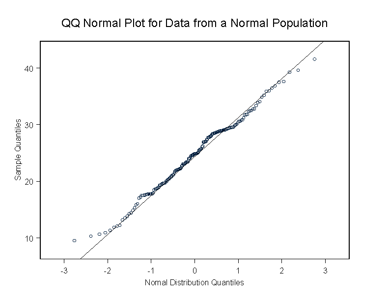
QQ Normal Plots: these plots are based on taking the observed quantiles of the data and plotting them against the quantiles of a standard Normal distribution. If the data were normally distributed, then the points should follow the straight line that has a slope that is the standard deviation of the data and that goes though the point (0, sample mean), ie normal quantiles = mean + Z*standard deviation. To create a QQ-normal plot, go to the Graph menu and select 2D Plot, and then select QQ Normal with Line. Click on OK. The theoretical normal quantiles go on the x-axis, so leave the x Column blank. Select the variable Sfat.dr for the y Column, then click on OK.
Here is a picture of a QQ Normal plot using 173 normal observations with a mean of 25 and a SD of 6.77 (matched to the mean as SD of Sfat.dr). There are a few departures from the line, but nothing major. (click on the image to enlarge)
Create summary statistics, histograms, boxplots, and QQ normal plots for each of the variables in exercise 5.67 (Sfat.dr, Sfat.ffq, Tfat.dr, Tfat.ffq, Calor.dr, and Calor.ffq). Do you think the assumption of a normal distribution is appropriate for each of these variables?
To explore the effect of transformations as in 5.67, create new variables based on the natural log transformation of each of the nutrients. To do this, go to the Data menu, select Transform... Enter the new name in the Target Column, i.e. lnSfat.dr, and then enter the tranformation in the Expression field, i.e. log(Sfat.dr). Repeat the summaries and plots to explore whethere the transformed data appear to have a normal distribution.
Turn in one paragraph (typed and confined to one page) summary of your findings for one of the nutrient variables from the diet record and the food frequency questionaire. Include a figure with the series of plots of the transformed and untransformed data. Make sure that each plot has clearly labeled axes, meaningful titles and the source of the data is indicated somewhere in the figure or figure caption.