In this part, we will learn how to simulate data from a Binomial distriution. The goal is to compare the frequency distribution of the sample to the theoretical probability distribution. Because of sampling variation, the frequencies in the sample may not match the theoretical probabilities exactly.
First we need to create a new dataframe to hold our simulation results. Go to the File menu, select New, and then Data Set.
Next we will generate the Binomial data. Go to the Data menu and select Random Numbers. In the dialog, specify Sample1 for the target column (this is where the values will be stored). In the Sampling box, specify 100 for the Sample Size field (this corresponds to the number of random samples we will draw). For the Distribution field, scroll up to binomial. In the Distribution Parameters box, enter 0.05 for the Probability and 10 for the Sample Size, corresponding to n=10 and p=0.05. Click on Apply. You should have a new column of 100 numbers generated from a Binomial(n=10, p=0.05) distribution.
Create a column Sample2 for the Binomial parameters in 4.94 (i.e. n=10, p=0.95)
Create a column Sample3 for the Binomial parameters in 4.95 (i.e. n=10, p=0.5)
You should now have three columns in your dataframe, Sample1, Sample2, and Sample3.
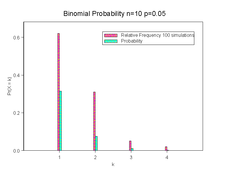
To create a barplot to represent the frequencies to compare to figure 4.4, we need to count how many 0s, 1s, ... 10s there were in each sample. The tabulate command will do this for us. Go to the Data menu and select Tabulate... Select the column that you want to tabulate, Sample1. As the possible values range from 0 to 10, there are 11 unique values, so enter 11 for Maximum Unique Numeric Values and for the Number of Bins for Numeric Values fields. Since we will need the output of this function for input to the barplot command, we will need to save the output. Enter Binomial1 in the Save In field. Click on OK. You should have a new dataframe with one column corresponding to the unique values for the binomial observations in Sample1 and a second column that corresponds to the number of times 0 appeared in Sample1, etc. For plotting purposes we would like to plot the relative frequency, so let's transform the Count: Go to the Data menu and select Transform... For the Target Column field, enter RelFreq. For the expression, enter
Count/sum(Count)
This will take each of the counts and divide them by the total (100).
For comparison to the theoretical probabilities, we can create a column that has the Binomial probabilities. Still keeping the Binomial1 dataframe active, go to the Data menu and select Distribution Functions. For each value in the column Sample1, we want to calculate Pr(X = 0), Pr(X = 1), .. Pr(X = 10) for the binomial distribution. While you can do this by hand now, we will use S-Plus to do this (Hint: here is a way to check some of your HW answers). For Source Column enter Sample1. For Statistic, click on Density, and for Distribution select binomial. For the Distribution Parameters, enter 0.05 for the Probability and 10 for the Sample Size. Click on OK. You should now see a column labeled Density. How do those values compare to the RelFreq column? Are they equal? Why or why not?
To make a Barplot of the two columns, go to the Graph menu, and select 2D Plot, and then select Bar - Grouped (x, y1,...yn). Click on OK. In the dialog, select Sample1 as the X column, and then select both RelFreq and Density as the Y columns. If you would like to make the widths narrower for the bars, click on the Position "tab" and then change the "Bar Width" to something like 0.1. Using the "By bar" tab you can change colors and fill patterns for the bars. Click on OK.
To clean up the plot, change the x-axis label to "k" and the y-axis label to "Pr(X=k)" as in Fig 4.4 (Hint: double click on the current labels and then replace the text). Add a title, such as "Binomial Distribution n=10 p=0.05"; go to the Insert menu and select Title. Add a legend, so that the two bar types are clearly labled; from the Insert menu select Legend. If you need to change the labels in the legend, simply double click on them and then edit the text.
Here is an example.... (double click on the image to enlarge)
How do the results compare to Figure 4.4a? Why do you think the counts do not go all the way up to 10 in the simulated data?
Repeat for Sample2 and Sample3 using the other binomial parameters (p=0.95 and p=0.5).
In this problem, you are to investigate whether sexes of successive childbirths are independent. The data set SEXRAT.XLS contains information on 51,868 families.Let's go ahead and read the data into S-Plus. First download it to your computer. To import it into S-Plus, go to the File menu and select Import Data, and then From File. Make sure that the File Type is set to Microsoft Excel Files *.xl *.xls, and then browse to select the file SEXRAT.XLS. Click on OPEN to read it in.
Take a look at the first row of the dataframe. The first column is the number of children in the family; which for the first row is 2. The next 5 columns correspond to the sex of the children in the family, Sx.1, Sx.2, ...Sx.5.. Since there are only 2 children for the first row, only the first two columns Sx.1 and Sx.2 have a value; the other 3 columns have the value NA which indicates missing data in S-Plus. For the first row, the two children are both Male (M). The last column is the number of families; out of the 51,868 families, there were 4400 families with 2 children that were both male.
If the sex of successive children is really independent of previous births, then what is the probability that a family would have exactly two Male children? What is the probability having a Male and then a Female? What is the probability that they would have a Female and then a Male? What is the proability of exactly two Female children? Looking at just families with two children, there are 4400+ 4270+ 4633 +4218 = 17521 families. How many of the 17521 families would you expect to have the exact birth sequence MM? MF? FM? FF? Create a new column "Expected", and enter in these values for families of size 2. Repeat this for families of size 3, 4, and 5.
Hint: to calculate the number of families of size 2, size 3, etc. use the Data Summary feature. Go to the Statistics menu and select Data Summaries, and the Summary Statistics. For the variable to summarize, select Num.fam. For the grouping variable select Nm.chld. This will provide summary statistics of Num.fam for each familiy size. The only statistic we care about is the total number of families. Click on the Statistics tab; in the Other Statistics field click on the Total Sum box. Uncheck all the other boxes, then clic on OK. The totals will appear in the report window.
What are your conclusions concerning the hypothesis in 4.68 based on your analysis of these data? Suggestion: create a scatterplot of the Observed Number of Families versus the Expected Number of Familes. (Use Graph -> 2D Plot, then select Scatterplot. If they were in perfect agreement what would you expect for the distribution? Can the differences be explained by sampling variation alone? Also create a new variable that is the difference of the observed and expected number of families. Plot the difference against the Number of Children -- are there any systematic features that would make you discard the hyothesis of independent births? Are there any other sumaries that are informative?
Write up a 1 paragraph summary (typed!) and include any plots or statistics that help make your case.